SOURCE: Sotheby’s
The concept of monochrome design is often misunderstood. In film and photography, the term denotes black, white, and gray, and so people may associate monochromatic color schemes with being colorless. But that’s not the case.
Monochrome design is all about color—selecting a single tone, and deploying it as a consistent theme around which a space is constructed. That’s the true definition of the term: “monochromatic” literally means one color.
While it can be a challenge to take a solitary hue and develop it into a dynamic palette, it’s uniquely chic when done effectively. Here’s a look at homes that pull this technique off with panache, and prove that monochrome design goes far beyond generic assumptions of somber shades.
Cultivating a Calmer Atmosphere Through Color
Every color is capable of eliciting an embodied response; a reaction that’s physiological and psychological, and by extension, emotional. And while hot, bright colors can evoke energy and passion, those that emulate nature can bring a grounded sense of peace similar to being near lush foliage or fresh water.
Here, the verdant colors of the exterior environment and the deep viridian tiles of the mosaic floors form the perfect foundation for a monochrome design in green, and serves as a reminder that monochromatic spaces don’t necessarily need to be neutral. Fittingly, this historic villa is an exemplar of Art Nouveau—a style that sought to simulate organic shapes and contours into art and architecture—and borders on the magnificent Parc du Cinquantenaire.
Utilizing Off-White Neutrals to Unify Your Space
While monochrome design may not need to use the typical shades, tints, and tones across the black-gray-white spectrum, off-white colors such as light browns and beiges are great choices for an on-trend yet timeless atmosphere that makes the most of beloved warm neutrals.
Fortunately, many materials used for fixtures, textures, and surfaces are warm neutral tones, which means a monochromatic design can easily encompass structural elements within the space. In this ultramodern rainforest retreat, natural wood floors, earthen brick walls, and artistic light fixtures reminiscent of wicker complement the colors used in the upholstery to achieve a harmonious aesthetic.
Building Thoughtfully on a Monochromatic Base
It’s important to remember that like all interior design styles, the rules of monochrome design aren’t rigid. They can be bent without being broken—and as such, contrasting colors can be creatively infused into a monochrome room.
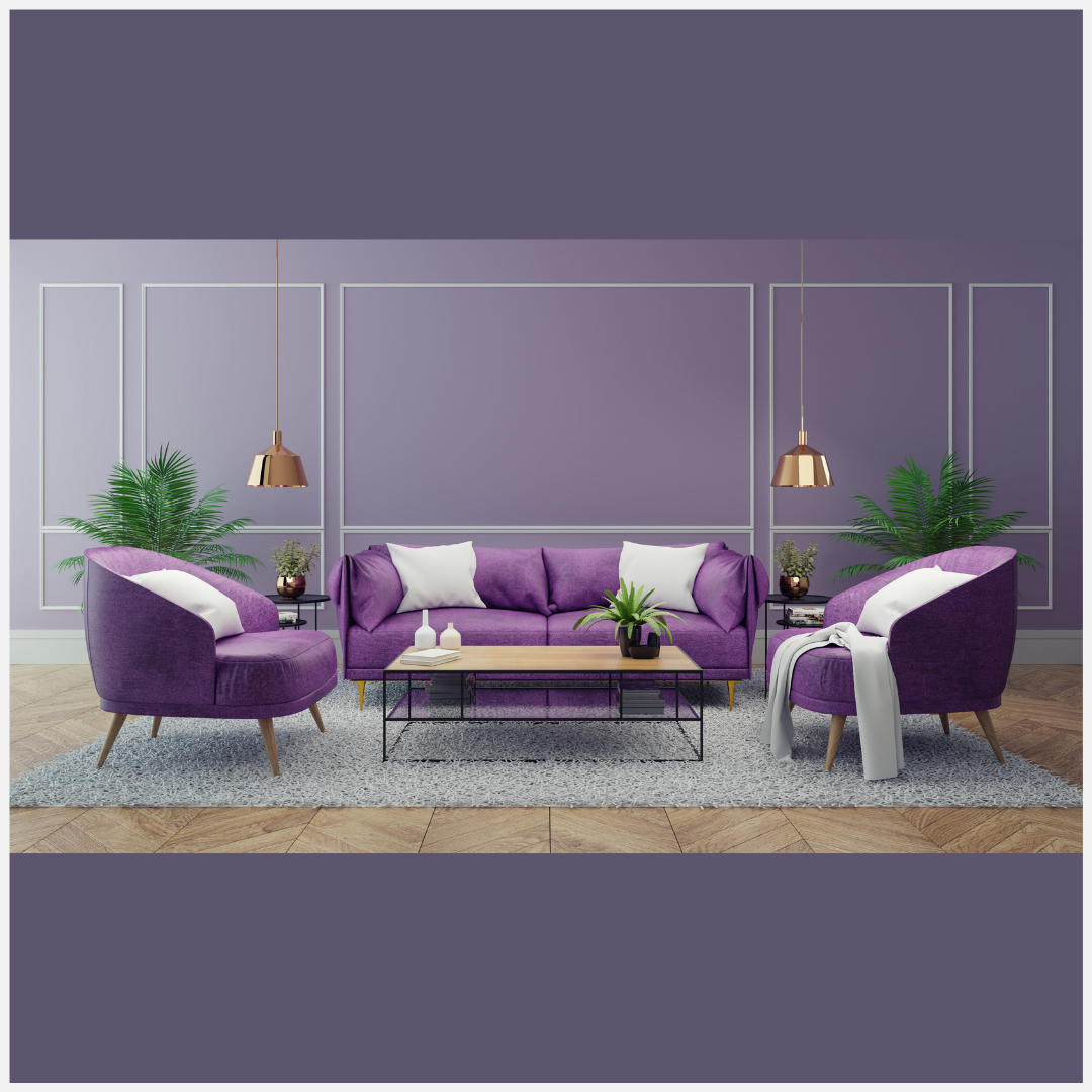
In this luxe apartment, a pale purple monochrome palette serves as a type of frame, and pops of soft beige and gold add compelling richness to the picture. The room is still monochrome, and decorators shouldn’t let a strict adherence to this principle constrain their choice of accents and accessories. Instead, any additions should service the primary purpose of the room, which is to instill comfort, wonder, and joy.
Choosing a Vibrant Hue for a Full Visual Impact
Most interior designers are familiar with the concept of a statement wall—a single surface that stands out and draws attention due to its distinctness. When creating monochrome spaces, there’s the opportunity to take this to another level with a statement room, where a single designated area is transformed by one color to invoke a very particular ambience or mood.
It’s a bold choice. But as demonstrated by the bathroom in this vivacious penthouse, bravery can pay dividends. The all-vermillion tile livens up the space in a way that’s unforgettable and unlike any other area within the home.
There are more possibilities to monochrome design than most people realize. Just start with a single, favorite visual queue and let it be your guide—it will give you the inspiration to use it in a variety of ways until you’ve created a space that invites and delights.
SOURCE: Sotheby’s

